


Picking a paint color for your living room can feel like a daunting task. This space is often the heart of your home, where you gather with friends and family, unwind after a long day, or entertain guests. With the right colors, you can create an atmosphere that feels fresh and inviting. That’s why I’ve put together this guide to help you explore some fantastic living room paint color ideas that are both eco-friendly and stylish.
If you’re someone who loves to create cozy living room aesthetics or is interested in the latest paint color trends, this guide is for you. Whether you’re a seasoned interior design enthusiast or just starting your home decor journey, you’ll find insights that resonate with your style and needs. I’ve gathered twelve inspiring color ideas that not only look great but also align with the principles of eco-friendly living.
As you read along, you’ll discover how different colors can influence mood and create a serene environment. Each idea in this post is curated to help you make a thoughtful choice that reflects your personality. From soft sage greens to warm terracotta shades, you’ll get tips on how to implement these colors effectively, ensuring your living room feels like a welcoming retreat.
Key Takeaways
– Explore 12 eco-friendly paint color ideas that enhance your living room’s aesthetics while being kind to the planet.
– Understand color psychology and how different shades can affect mood and ambiance in your space.
– Discover the latest paint color trends that combine beauty with sustainability for a fresh look.
– Learn practical interior design tips on how to pair colors and create harmonious living room color schemes.
– Get inspired to create a cozy atmosphere that reflects your personal style and enhances your daily living experience.
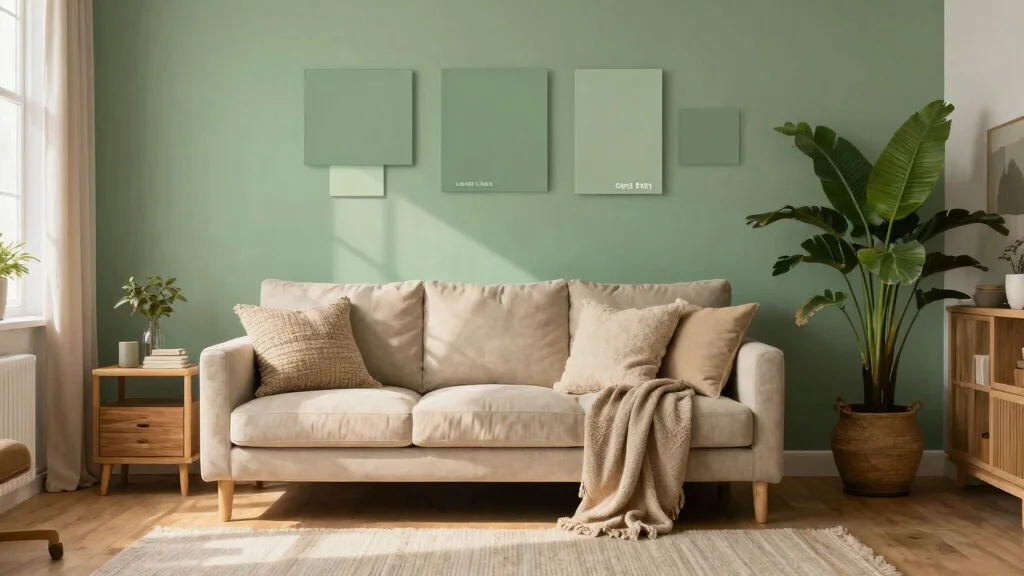
1. Soft Sage Green: Nature’s Embrace
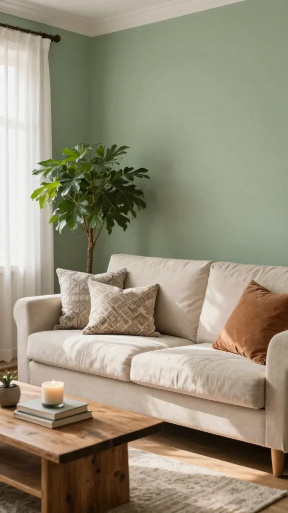
Soft sage green embodies a serene slice of nature, transforming your living room into a calming escape. This gentle hue radiates tranquility, making it perfect for creating a cozy atmosphere. Its versatility shines as it harmonizes effortlessly with various materials, from rustic wood to sleek metal accents, enhancing its earthy charm. Imagine soft sage walls paired with plush cream sofas and woven baskets for a welcoming feel.
To make the most of this soothing color, consider these practical tips: start with light furniture to let the sage pop, and incorporate plants to bring in that fresh, green vibe. You can also use creamy whites or warm terracotta accents to add warmth without overpowering the sage.
Maximize your design with these ideas:
– Pair sage-painted walls with light oak furniture
– Install greenery like ferns or snake plants for liveliness
– Use terracotta pots for a warm contrast
– Incorporate landscape artwork for a cohesive look
This approach not only enhances visual appeal but also promotes a serene atmosphere. Embracing natural textures and colors enriches your living space, making it a true sanctuary.
Soft sage green turns your space into a calm retreat, a natural win for living room color ideas. It blends easily with cream fabrics and wood textures, giving you practical, eco-friendly living room paint color ideas you can actually live with every day.


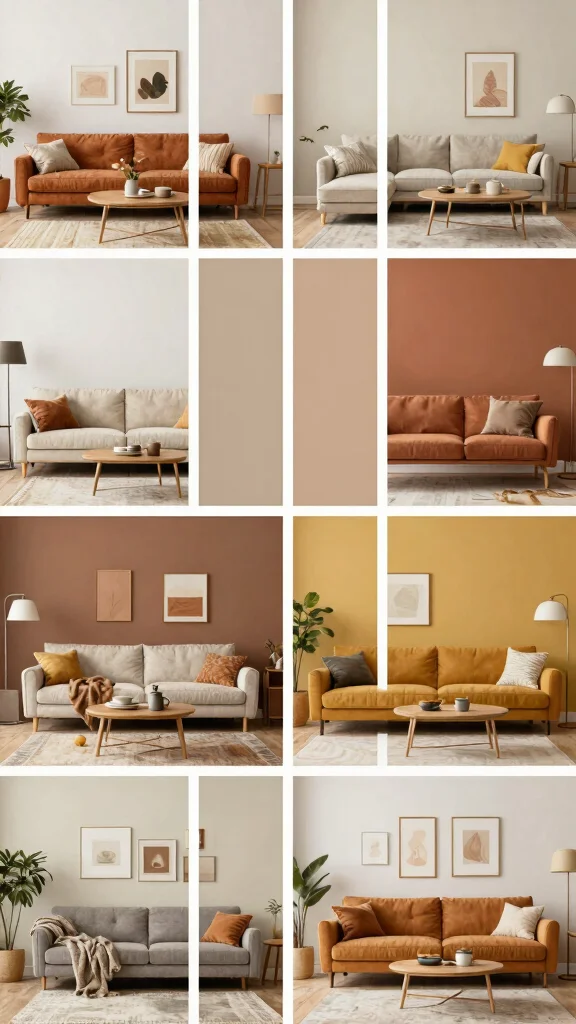
2. Terracotta: Warmth From the Earth
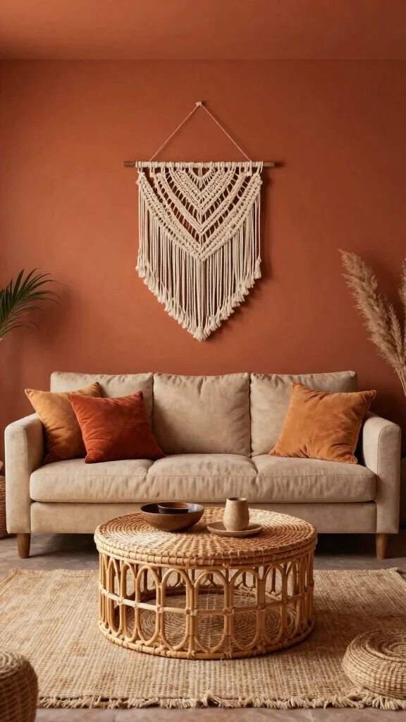
Terracotta is experiencing a delightful resurgence, bringing its warm, earthy tones into the spotlight. This captivating color serves as a rich backdrop for your living room, creating a cozy and inviting space. Whether you opt for a full terracotta wall or just an accent piece, it fosters a sense of comfort and connection to nature, making you feel right at home.
To effectively incorporate terracotta, consider pairing it with soft neutrals and greens for a balanced palette. Adding woven textures or raw wood furniture can further enhance this earthy vibe, creating a harmonious look that speaks to both modern and rustic styles.
Here are some quick tips:
– Pair terracotta walls with soft cream upholstery
– Install natural wood shelves for warmth
– Use textured fabrics to enhance coziness
– Incorporate green plants for a refreshing touch
This color not only creates a warm atmosphere but also evokes feelings of stability and comfort. By selecting eco-friendly paint options, you can enjoy a beautiful living space while being mindful of the environment.
3. Soft Blues: Serenity and Calm
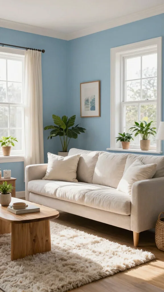
Soft blues bring to mind the tranquility of a clear sky and gentle waves, offering a refreshing vibe for your living room. This soothing color is particularly effective in smaller spaces, making them feel more expansive and airy. Its calming nature is ideal for crafting a peaceful environment where you can unwind and recharge after a busy day.
To enhance your design with soft blues, combine them with whites or light woods for a fresh, clean aesthetic. Layering with light textiles and introducing darker accent pieces can create depth and interest in your decor.
Consider these ideas:
– Combine soft blue walls with white trim for a classic look
– Use light fabrics like linen for a breezy feel
– Incorporate darker blue cushions for contrast
– Add artwork featuring blues and greens for cohesion
This calming hue promotes relaxation and helps reduce stress, making it perfect for a living room retreat. Opt for eco-friendly paint options to align your design choices with sustainability.


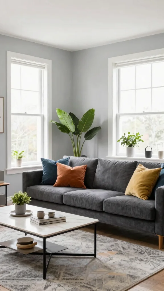
4. Rich Charcoal: Modern Elegance
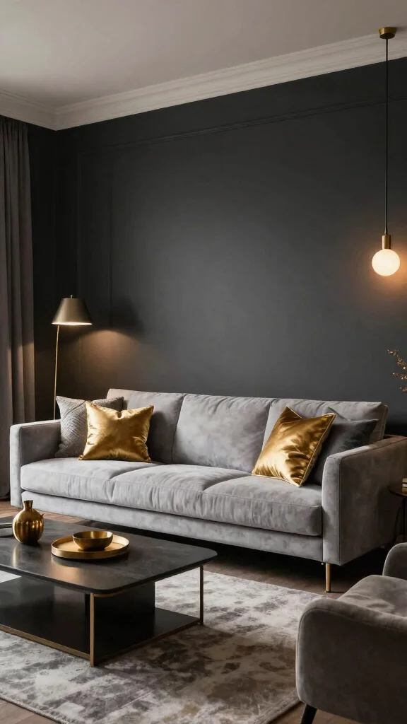
Rich charcoal is a bold option that exudes sophistication and style. This dramatic color serves as a stunning backdrop, allowing lighter furnishings and decor to truly shine. It strikes the perfect balance between cozy and chic, making your living room feel both inviting and elegant.
To style with charcoal effectively, opt for lighter furniture and accessories to create a striking contrast. Incorporating metallic elements can add a touch of glam, while various textures can keep the look dynamic and engaging.
Explore these styling tips:
– Use light-colored sofas to create contrast
– Incorporate metallic accents for a stylish touch
– Layer different textures like cushions and throws
– Use warm lighting to soften the overall look
This rich color not only enhances visual appeal but also evokes feelings of elegance and stability. Choosing eco-friendly paint ensures your stylish space is also environmentally conscious.
5. Soft Coral: A Touch of Warmth
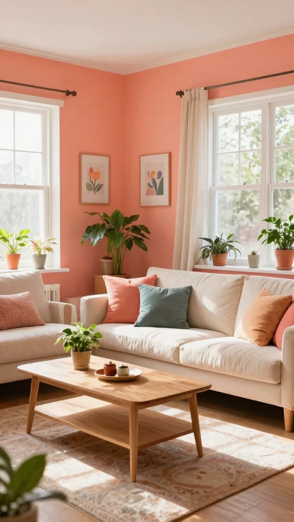
Soft coral infuses your living space with cheerful energy, making it feel both fresh and vibrant. This lively color is perfect for those wanting to add warmth without overwhelming the room. It beautifully complements both light and dark furniture, ensuring versatility in your design choices.
To incorporate coral effectively, balance its brightness with neutral tones. You can use it as an accent or on an entire wall to create a stunning focal point, and adding soft fabrics will enhance the overall comfort of the space.
Consider these best practices:
– Pair coral with neutral tones for balance
– Use it as an accent or feature wall
– Incorporate soft textiles like throws for coziness
– Combine with greens for a nature-inspired palette
This uplifting color can energize your living room, making it perfect for creating a joyful atmosphere. Remember to choose eco-friendly paint to keep your design sustainable.
Key Trade-offs & Our Top Pick
Soft Sage Green
– Pros:
– Creates a calming, nature-inspired atmosphere.
– Pairs well with both warm and cool accents.
– Eco-friendly options are widely available.
– Cons:
– May look dull in low light conditions.
– Can clash with some furniture styles.
– Might require multiple coats for full coverage.
– Best for: Those seeking a tranquil, refreshing vibe in their living room.
Terracotta
– Pros:
– Adds warmth and earthy tones to the space.
– Works well with rustic or bohemian decor.
– Instantly makes a room feel cozy and inviting.
– Cons:
– Can feel overwhelming in small spaces.
– May not suit modern or minimalist styles.
– Limited color matching options for furnishings.
– Best for: Homeowners looking to evoke a warm, earthy aesthetic.
Rich Charcoal
– Pros:
– Provides a sleek, modern look that adds sophistication.
– Pairs beautifully with bright accents or metallics.
– Ideal for creating a dramatic focal wall.
– Cons:
– Can make a room feel smaller if overused.
– Requires good lighting to avoid a cave-like feel.
– Maintenance might be tricky, as dust shows easily.
– Best for: Those wanting a chic, contemporary living room.
Soft Coral
– Pros:
– Brings a cheerful and uplifting vibe to the room.
– Works well in both contemporary and traditional styles.
– Pairs nicely with whites and light wood accents.
– Cons:
– May clash with certain color schemes.
– Brightness can fade over time with sunlight exposure.
– Not everyone’s favorite choice; personal preference plays a role.
– Best for: Individuals wanting to add a touch of fun and warmth.
Bright White
– Pros:
– Creates a clean, crisp look that makes spaces feel larger.
– Highly versatile, allowing for easy decor changes.
– Reflects light well, brightening dark corners.
– Cons:
– Shows dirt and fingerprints easily.
– Can feel sterile or uninviting without the right decor.
– Requires frequent touch-ups to maintain its freshness.
– Best for: Those seeking a timeless and versatile backdrop.
Best Overall: Soft Sage Green
Soft Sage Green stands out as the top choice for most living rooms. It balances tranquility with versatility, making it easy to match with various decor styles. This color brings the serenity of nature indoors while also being eco-friendly. With its calming properties, it can help create a cozy atmosphere that anyone would love to unwind in. Plus, it provides good value for money, as it works well with many accent colors and furnishings.
Why We Picked This:
We chose Soft Sage Green because it fits a wide range of tastes and home styles. If you prefer bold and warm colors, Terracotta or Soft Coral may catch your eye. For a modern, edgy feel, Rich Charcoal is an excellent option. Meanwhile, Bright White works beautifully for fans of minimalism. Each choice has its unique vibe, so consider your personal style and the atmosphere you wish to create when choosing your living room paint color.
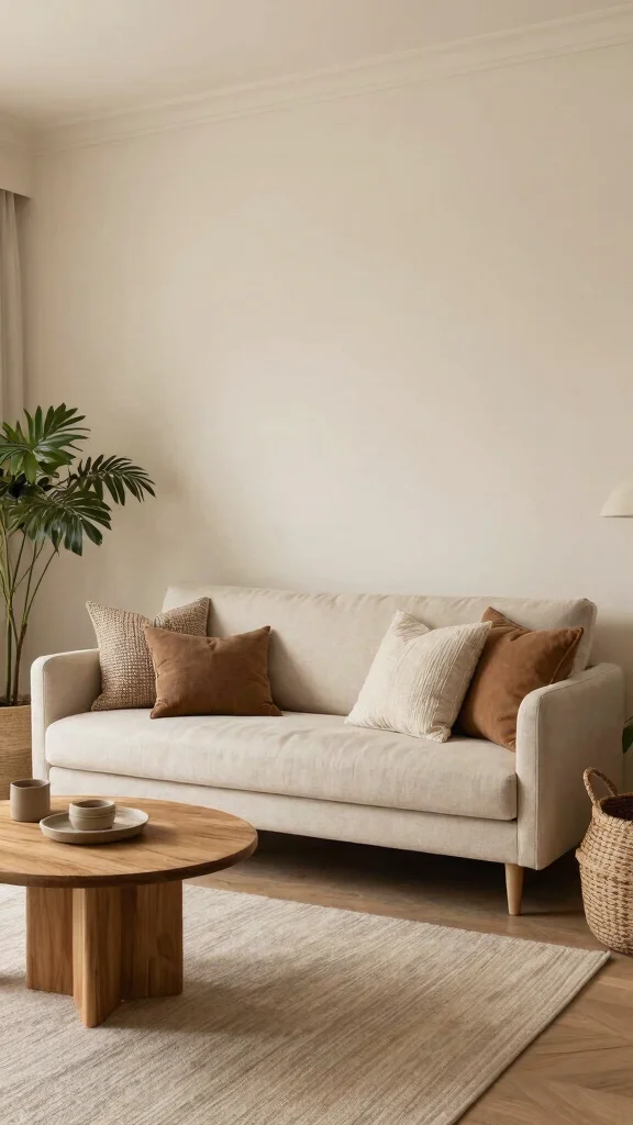
6. Warm Taupe: The Perfect Neutral
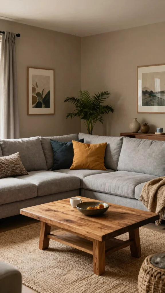
Warm taupe stands out as the ultimate neutral, providing comfort without being dull. It serves as a versatile backdrop for other colors, allowing for creative accents and decor. The earthy tones of taupe invite warmth, making it an excellent choice for a cozy living room setting.
To best utilize warm taupe, create contrast with darker accents like deep greens or navy. Layering textures with furniture and fabrics, along with adding bright art pieces, can help elevate the space’s aesthetic.
Here are some effective tips:
– Create contrast with dark accents for depth
– Layer textures with different materials for interest
– Add vibrant art pieces to pop against taupe
– Combine with wood elements for an organic feel
This color creates an inviting ambiance while grounding your space. Opt for eco-friendly, low-VOC paint options to maintain your commitment to sustainable living in home decor.
7. Dusty Pink: A Pop of Softness
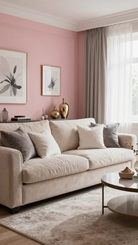
Dusty pink is a trendy choice that adds a touch of softness and sophistication to any living room. This muted tone infuses a hint of femininity while remaining understated, making it a versatile option that pairs beautifully with various colors. It enhances the warmth of your space without overwhelming it.
To design with dusty pink, combine it with whites or greys for a classy look. If you’re hesitant about using it in larger areas, start with smaller accents and incorporate metallic decor for a modern twist.
Explore these design ideas:
– Combine dusty pink with whites or greys for elegance
– Use it in smaller accents if unsure
– Add metallic decor for a contemporary touch
– Layer soft textiles to enhance comfort
This soothing hue can elevate your spirits and create a serene atmosphere, perfect for cozy gatherings. Choose eco-friendly paint options to reflect your sustainable values.
8. Olive Green: Bold Yet Cozy
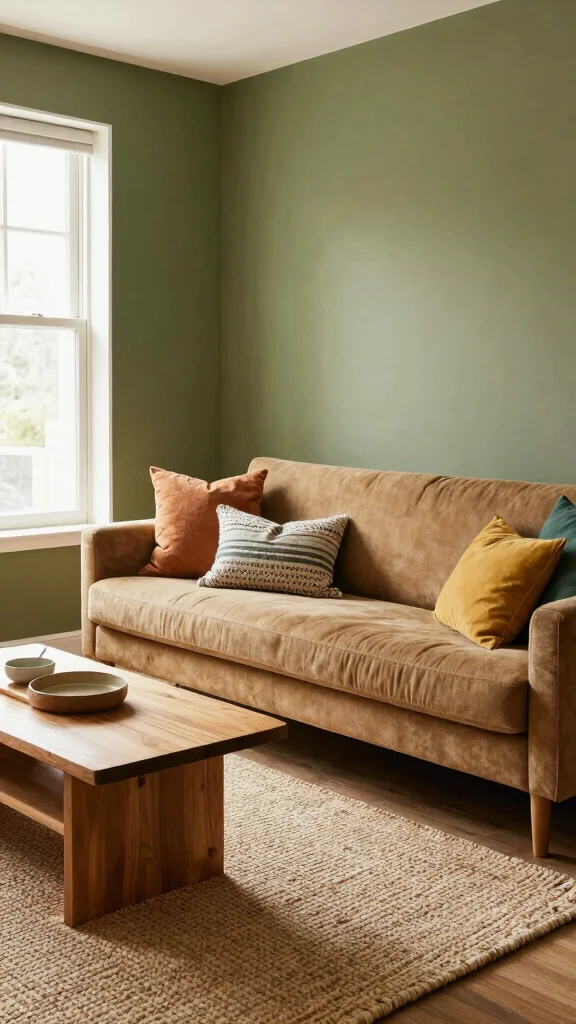
Olive green is a striking choice that brings boldness to your living room while maintaining a cozy feel. This deep shade connects your space with nature, fostering a serene and inviting environment. Pair it with lighter colors or natural wood to create a visually balanced look.
To effectively use olive green, combine it with warm neutrals for a grounded feel. Introduce textures like woven fabrics or plush rugs, and consider bright accents in yellows or creams to create visual interest.
Here are some tips for using olive green:
– Pair with warm neutrals for balance
– Introduce textured items for warmth
– Use bright accents for contrast
– Consider an accent wall for a focal point
This rich color can inspire feelings of peace and tranquility, making it ideal for a cozy retreat in your home. Opt for eco-friendly paint to ensure your design is sustainable.
Olive green walls nail the bold-but-cozy look—it’s eco-friendly without shouting. Pair it with warm neutrals and natural textures, and your living room paint color ideas instantly feel inviting, grounded, and totally on-brand for sustainable décor.
9. Bright White: Crisp and Clean
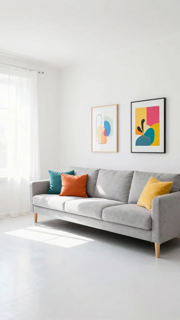
Bright white is often overlooked but can create a refreshing and clean palette in your living room. This classic choice allows light to bounce throughout the space, making it feel more expansive and airy. It serves as a blank canvas, letting bold colors in furniture and decor take center stage.
To style bright white walls effectively, use colorful artwork or decor to create engaging focal points. Layering textures like rugs and throws can help prevent a sterile look, while adding plants brings freshness and vitality to the space.
Consider these styling tips:
– Use vibrant artwork to create focal points
– Layer textures to add interest
– Incorporate plants for liveliness
– Use warm lighting to create a cozy ambiance
This color evokes clarity and peace, making it a serene choice for any home. Select eco-friendly, no-VOC paint for a healthier living environment.


10. Muted Lavender: A Gentle Touch
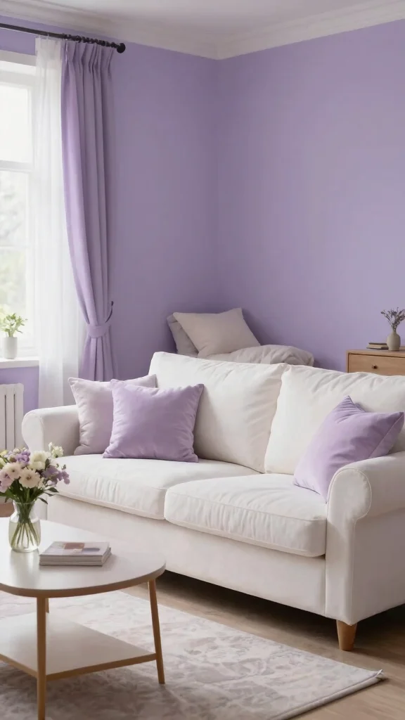
Muted lavender presents a subtle yet sophisticated hue, creating an inviting and calming atmosphere. This soft color pairs beautifully with whites, creams, and earthy tones, making it ideal for a serene living space. It’s perfect for crafting a cozy retreat that invites relaxation and tranquility.
To incorporate muted lavender, consider combining it with natural wood elements for a grounded feel. Using it in smaller accents like cushions or throws can ease you into the color, while adding metallics can enhance the elegance of the space.
Explore these suggestions:
– Combine with natural woods for warmth
– Use in small accents if hesitant
– Incorporate metallics for an elegant touch
– Consider using lavender in unique spaces like reading nooks
This unique color stimulates creativity and inspires calmness, making it a great choice for a restful living area. Opt for eco-friendly paints that resonate with your commitment to sustainable living.
Fun fact: muted lavender can boost perceived calm by up to 20% in living rooms when paired with whites and natural wood. Start small with cushions or throws to ease into the color, then layer with earthy tones for a serene, eco-friendly vibe.
11. Creamy Beige: Timeless Elegance
Creamy beige offers a classic elegance that remains timeless in any living space. This neutral shade adds warmth and sophistication, making it a favorite among those who appreciate enduring design. It pairs beautifully with almost any color scheme, enhancing its versatility across various decor styles.
To use creamy beige effectively, layer it with bold accent colors like deep blues or vibrant greens. Incorporating warm textures, such as knits and faux fur, can elevate comfort, while combining it with natural elements like wood creates a harmonious look.
Consider these ways to use creamy beige:
– Layer with bold colors for visual interest
– Add warm textures to enhance coziness
– Use it in airy spaces for a light feel
– Combine with natural elements for balance
This color creates a welcoming vibe while promoting feelings of comfort and relaxation. Choose eco-friendly paints that align with your values for a sustainable home.
12. Light Gray: The Modern Neutral
Light gray serves as an excellent choice for modern living room designs, merging seamlessly with a variety of colors and styles. Its neutrality creates a calm and sophisticated environment, making it perfect for any cozy nook in your home. This versatile shade works well in contemporary decor, providing a fresh backdrop for your design elements.
To maximize light gray, pair it with vibrant colors for a lively contrast. Mixing different textures can keep the decor interesting, while incorporating greenery adds a touch of life and freshness to the space.
Explore these ideas:
– Pair with bold colors for a modern twist
– Mix various textures for depth
– Incorporate plants for vibrancy
– Create layered lighting for warmth
This color evokes tranquility and sophistication, making it a beloved choice for living spaces. Opt for eco-friendly paint options to ensure your choices are stylish and sustainable.


Conclusion
Choosing the right paint color for your living room is an exciting journey that can transform your space into a cozy haven. From soothing greens to elegant charcoals, each of these twelve ideas offers something unique and appealing. Embracing eco-friendly options not only supports sustainability but also enhances the overall aesthetic of your home.
With the principles of color psychology in mind, you can create a living space that feels inviting and warm. Happy decorating!
Note: We aim to provide accurate product links, but some may occasionally expire or become unavailable. If this happens, please search directly on Amazon for the product or a suitable alternative.
This post contains Amazon affiliate links, meaning we may earn a small commission if you purchase through our links, at no extra cost to you.
Frequently Asked Questions
What are the best eco-friendly living room paint color ideas for a fresh, inviting space?
For an eco-friendly approach, start with low-VOC or zero-VOC paints and water-based finishes.
Test a few large swatches in natural light to evaluate your living room color schemes at different times of day.
Favor soft neutrals like warm beiges, creamy whites, and gentle greiges, and then layer in nature-inspired greens or earthy terracotta/clay tones for depth.
Choose sustainable surfaces and finishes (think low-toxin primers, recycled-content rollers) to keep the look cohesive.
Use color psychology in decor to set the mood — calm blues for serenity, warm taupe for coziness, and muted greens for balance.
Finish with a practical plan for upkeep and repainting when needed.
How do I choose a color palette for a cozy living room that is also eco-friendly?
Start with the space’s natural light and base it on an eco-friendly paint base; pick a main neutral from eco-friendly options.
Build a palette around one or two accent colors using ideas from living room color schemes.
Test swatches on walls or large boards and observe under morning, afternoon, and evening light.
Select finishes that are durable, washable, and low in volatile compounds.
Tie colors to color psychology in decor by selecting mood-appropriate hues: soft neutrals for calm, gentle greens for balance, and warm terracotta for coziness.
Finally, assemble a small, sustainable accessory mix to complete the look.
Which colors are trending for eco-friendly living rooms right now?
Earthy, subdued tones lead the way—think clay, oatmeal, mushroom, and greiges.
Nature-inspired greens and dusty blues provide calming backdrops.
For eco-friendly choices, look for paints with low-VOC or zero-VOC formulations and responsibly sourced pigments.
Use these colors as the wall canvas and keep the rest of the room with sustainable furnishings.
Always test colors with large samples in natural daylight to see how they evolve with paint color trends over time, and lean into cozy living room aesthetics in your final picks.
How does color psychology influence a cozy living room when picking paint colors?
Color psychology in decor matters: blues and greens promote calm and focus, warm neutrals foster coziness, and muted earthy tones ground the space.
Start by choosing the mood you want, then select a main neutral and supportive accents accordingly.
Test how your choices feel in real life by painting a small area or using large swatches, and combine with lighting, textiles, and furniture to reinforce the mood.
Use eco-friendly paints to keep the experience healthy for you and the planet.
What steps can I take to test and apply living room paint color ideas without wasting resources?
Begin with large, portable swatches or sample cans from an eco-friendly brand.
Paint several wall areas or large boards to compare under morning, afternoon, and evening light.
Use a simple, recyclable tester setup and remove or cover with drop cloths when not testing.
Create a small, sustainable palette first, then refine with one or two final choices.
Once you commit, use the best eco-friendly finish and properly dispose of leftover cans.
Keep a digital record of preferences and lighting conditions to avoid extra re-paints.
Related Topics
living room paint colors
eco-friendly decor
color psychology
cozy aesthetics
paint color trends
interior design tips
fresh color schemes
inviting spaces
budget friendly
beginner friendly
seasonal colors
minimalist design
