
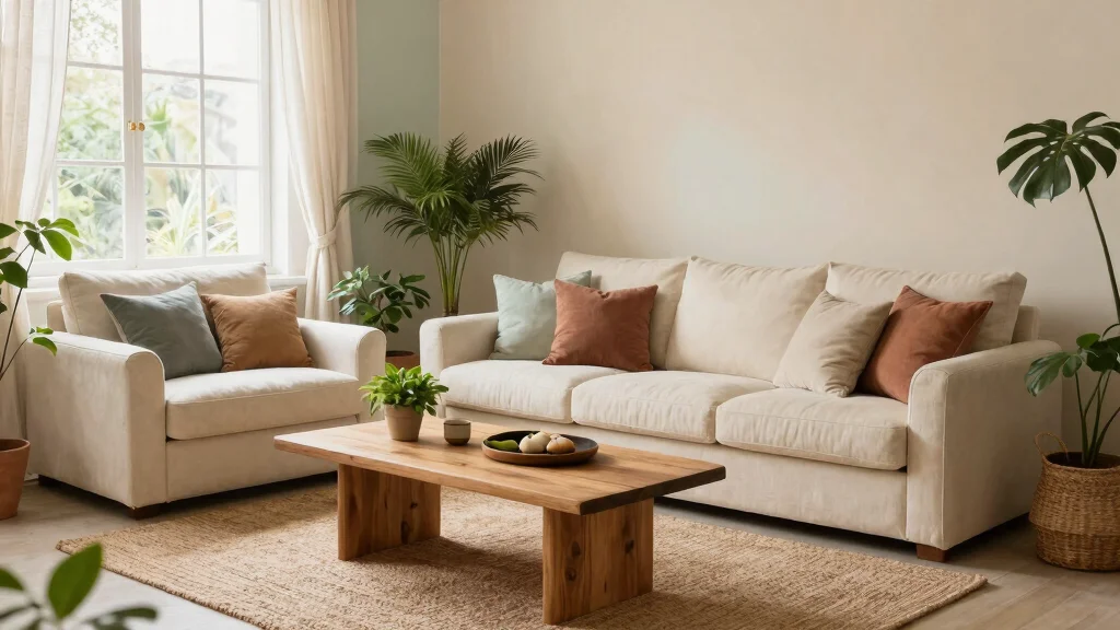


Choosing the right color scheme for your living room can be a delightful yet daunting task. You want a space that feels balanced, warm, and polished—one that invites you to relax after a long day. I created this guide to help you navigate the exciting world of living room color scheme ideas and to spark your creativity. Whether you’re decorating a brand-new home or refreshing your existing space, finding the perfect color palette can dramatically transform your living area.
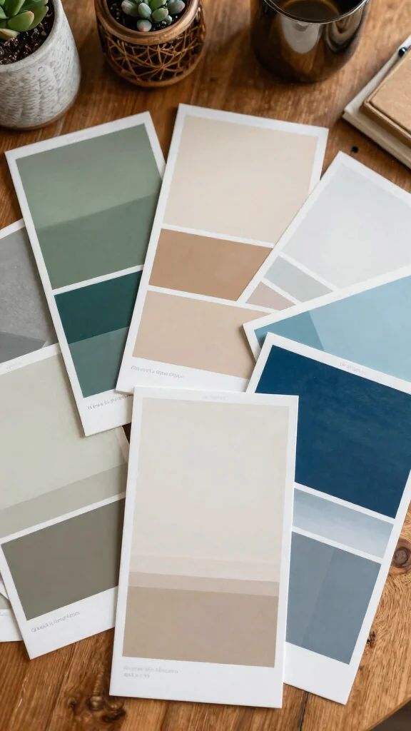
If you’re someone who loves home decor and aims for a stylish yet comfortable atmosphere, this post is for you. You might be looking for eco-friendly options or simply want to align your space with the latest living room color trends. Here, you’ll discover twelve inspiring ideas that blend aesthetics with warmth, allowing you to create a balanced room design that feels just right. From earthy greens to elegant grays, I’ve compiled a variety of palettes that can help you achieve that polished home decor you crave.
As you explore these ideas, you’ll gain insights into how different colors can affect your mood and the overall vibe of your living room. You’ll find practical tips for incorporating these hues into your space, whether through paint, furniture, or accessories. Get ready to transform your living room into a haven that reflects your personal style while embracing comfort and balance.
Key Takeaways
– Discover how different colors impact the ambiance of your living room, enhancing comfort and style.
– Learn about twelve unique color schemes ranging from earthy greens to bold jewel tones that suit various tastes.
– Understand the importance of a balanced interior color palette for creating a cohesive and inviting space.
– Find out practical tips for incorporating warm living room colors through paint or decor without overwhelming your space.
– Get inspired by current living room color trends to keep your home decor fresh and inviting.
1. Earthy Greens Infusion
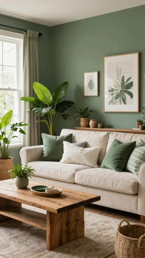
Embracing earthy greens in your living room fosters a sense of calm and a deep connection to nature. This vibrant yet soothing palette works wonders by combining rich forest greens with lighter sage and mint tones, creating a tranquil atmosphere that feels both fresh and polished. For instance, think of a deep green accent wall paired with soft sage furniture, providing visual harmony throughout the space.
To implement this look, consider incorporating natural materials like bamboo furniture or reclaimed wood for a sustainable touch. To complement the greens, introduce beige or sandy textiles that enhance the earthy vibe without overpowering it.
Tips:
– Pair varying shades of green for depth.
– Utilize natural light to enhance the colors.
– Introduce indoor plants that echo the palette.
Suggested Combinations:
– Forest Green + Cream + Light Wood.
– Mint Green + Beige + Olive Green.
This harmonious combination not only radiates warmth but also nurtures a peaceful atmosphere in your living space.
2. Warm Neutrals with a Touch of Color
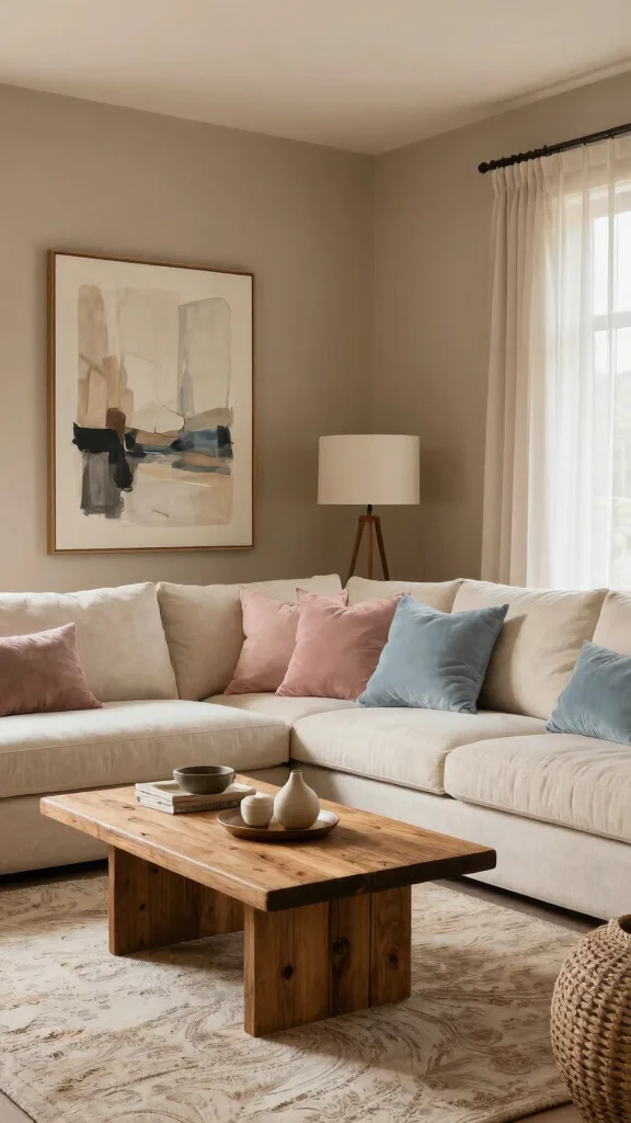
Warm neutrals such as taupe, ivory, and soft browns lay a perfect foundation for a cozy living room. These versatile shades act as a canvas, allowing other colors to shine while creating a welcoming and serene environment. For example, a taupe sofa paired with dusty pink or muted blue accents adds depth and interest without overwhelming the senses.
To achieve this look on a budget, incorporate colorful throw pillows, artwork, or a vibrant statement chair. Keeping your palette limited ensures balance while connecting to broader trends of comfort and sophistication.
Tips:
– Mix various textures for added richness.
– Limit colors to maintain a cohesive look.
– Select eco-friendly fabrics for cushions and throws.
Suggested Combinations:
– Taupe + Dusty Pink + Beige.
– Ivory + Soft Blue + Light Brown.
This stylish combination invites warmth and sophistication, making your living room effortlessly chic.


3. Coastal Blues and Sandy Tones
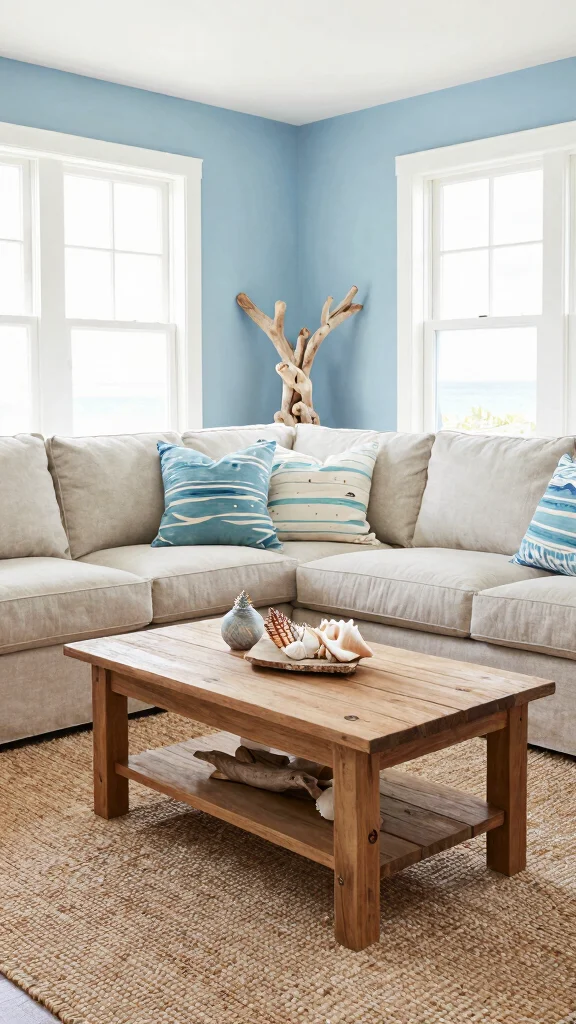
Invite the beach into your living room with a coastal-inspired color scheme that features soft blues and sandy beiges. This pairing creates a fresh and airy environment, perfect for those wanting a light and relaxed space. For example, a light blue accent wall coupled with driftwood furniture evokes a sense of tranquility, making your living area feel polished yet laid-back.
To enhance this look, consider sustainable materials like reclaimed wood and organic cotton textiles. This approach not only enhances your coastal vibe but also aligns with eco-conscious living.
Tips:
– Incorporate beach-inspired textures like linen and cotton.
– Use decor elements inspired by the ocean, such as shells.
– Mix different shades of blue for added depth.
Suggested Combinations:
– Soft Blue + Sandy Beige + White.
– Teal + Light Cream + Driftwood Accents.
This color scheme creates a soothing environment, perfect for unwinding after a long day.
Cozy coastal vibes start with simple choices—soft blues, sandy beiges, and a touch of driftwood. Swap in reclaimed wood and organic cotton textiles, and your living room color scheme ideas become calm, balanced, and easy to live with.
4. Elegant Grays with Pops of Color
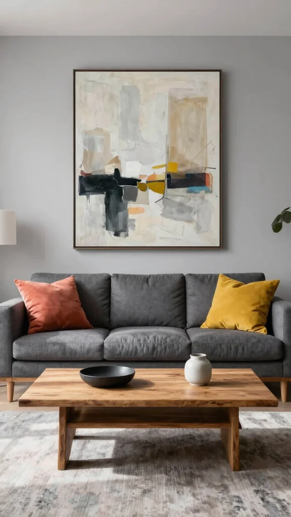
Gray is a timeless choice that brings sophistication to modern living rooms. This versatile color serves as an elegant backdrop, easily dressed up with vibrant accent colors like mustard yellow or coral. For a chic yet inviting atmosphere, consider layering different shades of gray—from light to charcoal—to create visual interest and depth.
Incorporate sleek, sustainable furniture to enhance the polished look, while warm lighting adds a cozy touch to your space. This balance makes gray an appealing option for a stylish living area.
Tips:
– Use artwork to introduce vibrant pops of color.
– Vary textures to warm up gray tones.
– Choose eco-friendly paint options for your walls.
Suggested Combinations:
– Light Gray + Coral + Dark Gray.
– Charcoal + Mustard Yellow + White.
This modern approach to color is fresh and sophisticated, perfect for creating a stylish haven.
5. Rustic Warmth with Deep Reds and Browns
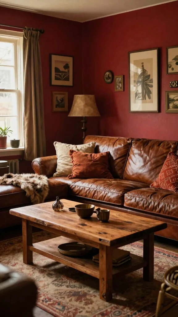
If a rustic aesthetic resonates with you, deep reds and rich browns can create an inviting living space that feels cozy and warm. These colors evoke comfort, making your home a perfect gathering spot for family and friends. Pairing these hues with natural materials like leather or reclaimed wood enhances the rustic charm, creating a warm and welcoming atmosphere.
Warm lighting and textured fabrics, such as wool throws, can further enhance the cozy vibe. An accent wall in deep burgundy, complemented by beige or cream, helps balance the overall look while adding depth.
Tips:
– Incorporate antiques or vintage items for character.
– Layer fabrics for added warmth and texture.
– Opt for eco-friendly furnishings for sustainability.
Suggested Combinations:
– Deep Burgundy + Cream + Dark Wood.
– Rust + Soft Beige + Brown.
This palette creates a cozy haven, welcoming everyone into your space.
6. Soft Pastels for a Serene Retreat
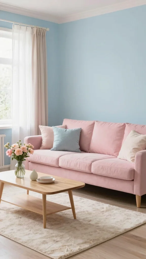
Soft pastel colors create a dreamy environment in your living room that feels both elegant and calming. Hues like pale blue, soft pink, and lavender can transform your space into a peaceful retreat, promoting relaxation in your home. For a cohesive look, pair these pastels with neutral tones and natural materials, enhancing the serene vibe.
Consider using soft fabrics for cushions and throws, coupled with light wood furniture to maintain a polished aesthetic. Eco-friendly options, such as organic cotton and bamboo, can also be incorporated for a sustainable touch.
Tips:
– Use multiple pastel colors for a harmonious effect.
– Add plants for a refreshing touch.
– Keep decor minimal to maintain tranquility.
Suggested Combinations:
– Pale Blue + Soft Pink + White.
– Lavender + Cream + Pale Green.
This combination creates a delightful living space that nurtures peace and relaxation.
Key Trade-offs & Our Top Pick
Option 1: Earthy Greens Infusion
– Pros:
– Invokes a sense of nature and tranquility. 🌿
– Pairs well with natural materials like wood and stone.
– Cons:
– Can feel dark if the space lacks natural light.
– May limit your choice in furniture colors.
– Best for: Homes surrounded by nature or those wanting a calming atmosphere.
Option 2: Warm Neutrals with a Touch of Color
– Pros:
– Offers a versatile backdrop that complements any decor style.
– Makes small spaces feel larger and more inviting. 💡
– Cons:
– May appear too bland without the right accent pieces.
– Can clash if overly bright colors are used as accents.
– Best for: Those who want a timeless look with room for personal expression.
Option 3: Coastal Blues and Sandy Tones
– Pros:
– Creates a fresh, airy feel reminiscent of the beach. 🌊
– Harmonizes well with natural fibers and light wood.
– Cons:
– Might not suit every region, especially inland locations.
– Requires careful selection of accessories to avoid a kitschy look.
– Best for: Beach enthusiasts or anyone wanting a light, breezy vibe.
Option 4: Elegant Grays with Pops of Color
– Pros:
– Provides a sophisticated and modern look.
– Allows for flexible accent colors to change with trends. 🎨
– Cons:
– Can feel cold if not balanced with warm elements.
– May require more frequent updates to keep the palette fresh.
– Best for: Contemporary homes where a chic aesthetic is desired.
Option 5: Rustic Warmth with Deep Reds and Browns
– Pros:
– Offers a cozy and inviting atmosphere ideal for family gatherings.
– Works well with vintage and rustic furniture.
– Cons:
– Can feel heavy if used excessively.
– May not suit modern tastes or styles.
– Best for: Cabins or farmhouse-style interiors that aim for a homey feel.
Expert Recommendation:
Best Overall: Warm Neutrals with a Touch of Color
This option is the top choice for most people because it offers incredible versatility. You can easily add or change accent colors to reflect your mood or the season. It works great in both large and small spaces, making it a safe and stylish choice. Plus, it’s durable—neutral colors tend to age well, saving you time and money on redecorating.
Why We Picked This:
While warm neutrals are fantastic for most settings, those who lean towards bold expressions may prefer options like Bold Jewel Tones or Earthy Greens. If you want a lively space or crave a natural vibe, these alternatives might be more appealing.
7. Bold Jewel Tones for Dramatic Flair
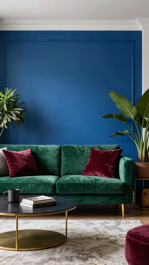
If you want to make a statement, bold jewel tones like emerald green, sapphire blue, and rich burgundy are the way to go. These colors add depth and drama to your living room, serving as a stunning focal point in your home. When used thoughtfully, jewel tones can strike a sophisticated balance that feels both chic and inviting.
Consider using jewel tones in furnishings, such as a velvet sofa or deep-hued curtains, to create a polished look. Pairing these vibrant colors with neutral accessories helps maintain balance while enhancing the overall aesthetic with sustainable materials.
Tips:
– Balance bold hues with neutral tones for harmony.
– Use rich textures to elevate the colors.
– Add gold or brass accents for a touch of elegance.
Suggested Combinations:
– Emerald Green + Neutral Beige + Gold Accents.
– Sapphire Blue + Light Gray + Silver Accents.
This approach creates a luxurious atmosphere, perfect for a sophisticated living space.
Bold jewel tones can elevate living room color scheme ideas into a polished, eco-friendly retreat. Choose low-VOC paints or fabrics and balance with neutrals for practical, lasting style.
8. Minimalist Monochrome Elegance

For fans of minimalist design, a monochrome color scheme offers sophistication and timeless appeal. Utilizing various shades of a single color, such as gray or beige, results in a polished, uncluttered look that feels serene and inviting. This approach emphasizes cleanliness and simplicity, often enhanced by eco-friendly materials that promote sustainability.
Incorporate various textures through cushions and rugs to add dimension and avoid a flat appearance. Natural light plays a crucial role in highlighting the subtle nuances of color throughout the space.
Tips:
– Stick to a limited color palette for clarity.
– Use accessories to introduce warmth and texture.
– Consider eco-friendly materials for furnishings and decor.
Suggested Combinations:
– Shades of Gray + White Accents.
– Creams and Beiges with Natural Wood Elements.
This design choice is particularly appealing for modern homes that prioritize simplicity and elegance.
9. Vibrant Citrus Accents
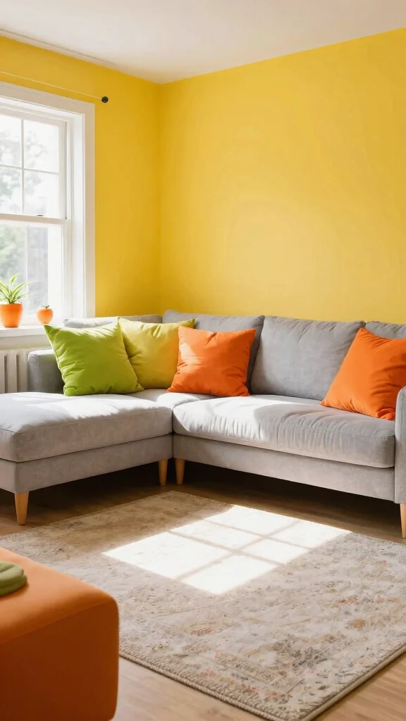
Looking to infuse energy into your living room? Citrus colors like lemon yellow, lime green, and tangy orange can create a fresh and vibrant atmosphere. These lively hues are perfect for establishing a cheerful environment that feels welcoming and fun. For a balanced look, consider incorporating citrus colors through small decorative pieces such as cushions or wall art.
Pairing bright citrus tones with neutral backgrounds keeps the overall design polished while allowing the colors to pop. Soft lighting can further enhance the lively ambiance, making your space even more inviting.
Tips:
– Use citrus tones sparingly to avoid overwhelming the space.
– Mix with neutral tones for balance.
– Incorporate eco-friendly decor options for sustainability.
Suggested Combinations:
– Lemon Yellow + Gray + White.
– Lime Green + Soft Beige + Light Wood.
This approach energizes your living space, transforming it into a joyful gathering spot.
10. Timeless Black and White Contrast
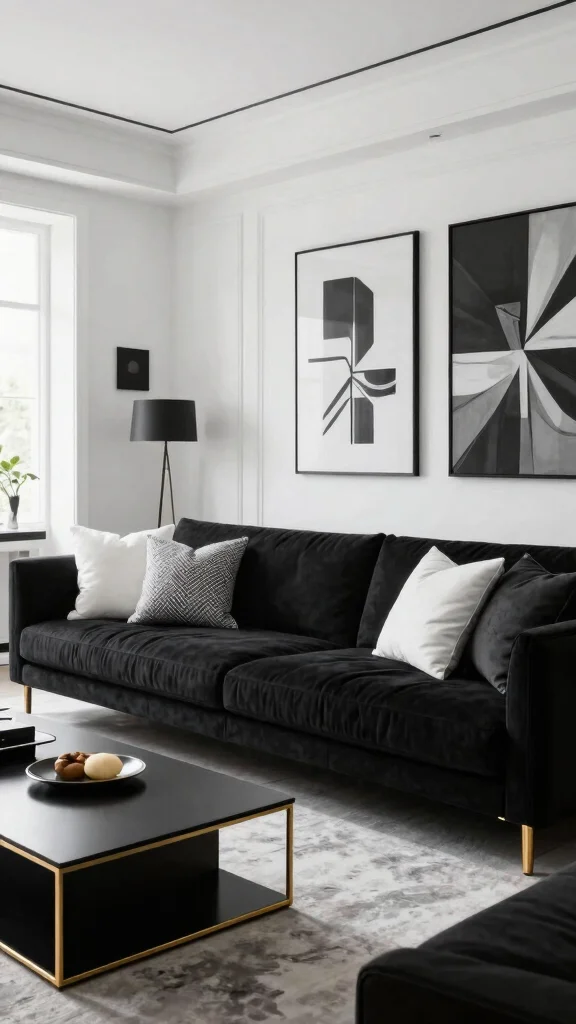
Black and white is a classic color scheme that adds modern sophistication to any living room. This timeless combination creates striking contrast, elevating your space with a chic flair. To keep the look dynamic, incorporate different textures and patterns that prevent the design from feeling flat.
Consider pairing black furniture with white walls, adding decorative elements in gold or metallic for a glamorous touch. Using eco-friendly materials allows you to maintain a polished feel without sacrificing sustainability.
Tips:
– Mix patterns for added visual interest.
– Use natural light to soften stark contrasts.
– Opt for eco-conscious furniture and fabrics.
Suggested Combinations:
– Black + White + Gold Accents.
– Soft White + Charcoal + Natural Textures.
This combination encourages creativity while maintaining a chic and elegant aesthetic.
Fun fact: When you explore living room color scheme ideas in black and white, you get timeless contrast with modern texture. Pair matte black furniture with white walls and eco-friendly materials for a polished, lasting look.
11. Nature’s Palette with Terracotta and Sage
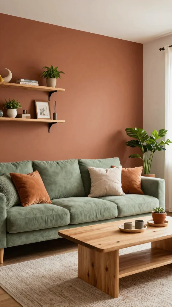
Inspired by nature’s tones, a color scheme featuring terracotta and sage green evokes warmth and grounding in your living room. Terracotta brings earthy warmth, while sage offers a fresh contrast, creating a harmonious and inviting atmosphere. This palette is perfect for eco-friendly living, reflecting nature and promoting a calming environment.
Utilize terracotta for wall accents or pottery, pairing it with sage-colored upholstery or cushions for a cohesive look. Incorporating wood elements and plants enhances your connection to nature, further enriching your space.
Tips:
– Add natural wood finishes to complement the palette.
– Use a mix of textures for enhanced coziness.
– Opt for eco-friendly materials in your furnishings.
Suggested Combinations:
– Terracotta + Sage + Natural Wood.
– Olive Green + Terracotta + Cream.
This color scheme provides a cozy, pastoral feel, making your living space warm and inviting.
12. Charming Vintage Hues
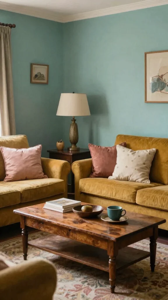
Vintage hues like muted mustard, faded teal, and dusty rose create a nostalgic and charming atmosphere in your living room. These colors resonate with warmth and character, making your space feel inviting and cozy. Incorporating vintage-inspired furniture and decor enhances the aesthetic, creating a sense of history and personality in your home.
Look for eco-friendly vintage pieces that tell a story—think thrifted or upcycled items to maintain a sustainable theme. Texture is paramount, so consider soft linens and vintage patterns for your fabrics, adding visual interest.
Tips:
– Include unique vintage finds to personalize your space.
– Layer textiles for added warmth and comfort.
– Balance bold colors with neutral tones for harmony.
Suggested Combinations:
– Muted Mustard + Faded Teal + Cream.
– Dusty Rose + Soft Gray + Natural Wood.
This color scheme is ideal for those wanting to infuse vintage charm and warmth into their living space.
Conclusion
Choosing a living room color scheme is an exciting opportunity to express yourself and create a welcoming atmosphere. From soothing earth tones to vibrant accents, these twelve ideas demonstrate that you can achieve a balanced, warm, and polished look while embracing eco-friendly options. Explore these color schemes to find the perfect palette that resonates with your personal style and values, making your living space feel uniquely yours.
Feel free to experiment and let your creativity shine in every brushstroke of color!
Note: We aim to provide accurate product links, but some may occasionally expire or become unavailable. If this happens, please search directly on Amazon for the product or a suitable alternative.
This post contains Amazon affiliate links, meaning we may earn a small commission if you purchase through our links, at no extra cost to you.
Frequently Asked Questions
What eco-friendly color palette works best for a balanced living room color scheme?
For a balanced living room color scheme that is eco-friendly, start with a warm, neutral interior color palette as your base (creamy whites, soft beiges, warm grays).
Then add a nature-inspired accent color (sage, clay, muted blue) drawn from natural materials.
Use eco-friendly paints with low VOC or natural pigments and pair them with sustainable textiles and decor.
Test color swatches in daylight and live with the samples for a few days before committing.
Stick to a simple rule like 60-30-10 to keep the space balanced and ensure the balanced room design feels polished home decor ready.
Which warm living room colors pair well with eco-friendly materials for a polished look?
Warm living room colors like soft taupe, warm white, terracotta, and sage work beautifully with sustainable materials such as reclaimed wood, cork, linen, and organic cotton.
Build your color palette around a neutral base, then use a few muted accent colors to add depth.
Choose paints and wallpapers with low VOC or natural pigments, and select furniture with durable, ethically sourced finishes to keep the space polished home decor intact while staying eco-friendly.
Don’t forget lighting—warm LEDs can enhance the undertones and make colors feel richer.
How can I apply living room color trends without sacrificing sustainability?
Start with a timeless base and pick one on-trend shade as an accent rather than the main color. This keeps your living room color scheme ideas current but resilient to changing trends.
Choose eco-friendly paints, low VOC finishes, and textiles made from recycled or natural fibers.
Use accessories—cushions, throws, artwork—to update the look seasonally, which is cheaper and more sustainable than repainting.
A balanced room design emerges when you layer color with texture and light, not with clutter.
What practical steps can I take to test and apply an interior color palette in a living room while staying eco-friendly?
Start by sampling interior color palette swatches on multiple walls and observing them in natural and artificial light across different times of day.
Choose a neutral base and build with a few eco-friendly accents.
Use low-VOC paints, natural pigments, and water-based finishes.
Select sustainable textiles (organic cotton, hemp, jute) for upholstery and curtains.
Apply color with painter’s tape to create clean lines and add texture with woven rugs and wood furniture.
Finally, reassess after a week to confirm you love the look before committing.
How do I create a balanced, warm, and polished living room color scheme using eco-friendly ideas?
Begin with a warm, neutral base from an interior color palette you adore, then layer two to three harmonious accent colors drawn from natural materials.
Keep a balanced room design by using the 60-30-10 rule, ensuring main color, secondary color, and accessories are proportioned.
Choose low VOC paints and natural pigments, sustainable textiles, and furniture with timeless lines to maintain a polished home decor look.
Finish with layered textures, soft lighting, and greenery to cue a warm, inviting vibe that stays eco-friendly and stylish. This approach aligns with living room color scheme ideas and trends while remaining conscious of the environment.
Related Topics
living room color scheme
warm living room colors
interior color palette
balanced room design
polished home decor
eco-friendly decor
color trends 2023
beginner friendly
sustainable living
neutral tones
cozy atmosphere
DIY color ideas
