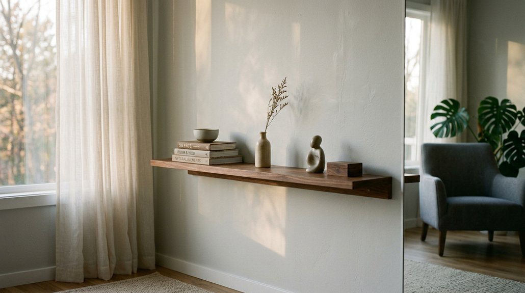


You want shelves that look intentional, not cluttered. Start with three items: one plant, one leaned print, one textured object. Vary heights, leave 8–12 inches between clusters, and keep 70% of surface open. Mix wood, ceramic, and matte finishes for depth.
Place eye-level shelves near seating. Edit until it feels almost too sparse. The trick isn’t adding more; it’s knowing what to remove. Ten arrangements wait ahead, each built on these same rules.
Style Floating Shelves With the Rule of Three
Why do some shelves feel effortless while others fall flat? You’re likely violating the rule of three.
Start with a three-item group, your core building block for dynamic shelves. Varying heights create visual tension and natural uneven balance you cannot achieve with pairs or symmetrical layouts. A tall plant, medium leaned print, and short candle establish depth layering without overthinking.
On longer shelves, form two three-item groups. Leave deliberate rhythm and space between them (roughly 8-12 inches) to prevent crowding.
Remove one item when clutter appears. You’re restoring harmony, not losing something.
The foolproof trio: one plant, one leaned print, one small object with different textures. This three-item cluster works every time because odd numbers force your eye to travel rather than settle.
Recommended Products

【Transform Books into Wall-Mounted Art】: The ultra-slim profile disappears behind a single book, creating a morden invisible shelf that makes your books look like they are floating. Perfect for book lovers and home decor enthusiasts.

Ideal for Plant Lovers: These wall plant shelves are designed to showcase your favorite plants, turning any living room, bedroom, or bathroom into a green oasis. The floating shelf design keeps your space organized and stylish
Layer Tall, Medium, and Short Items for Depth
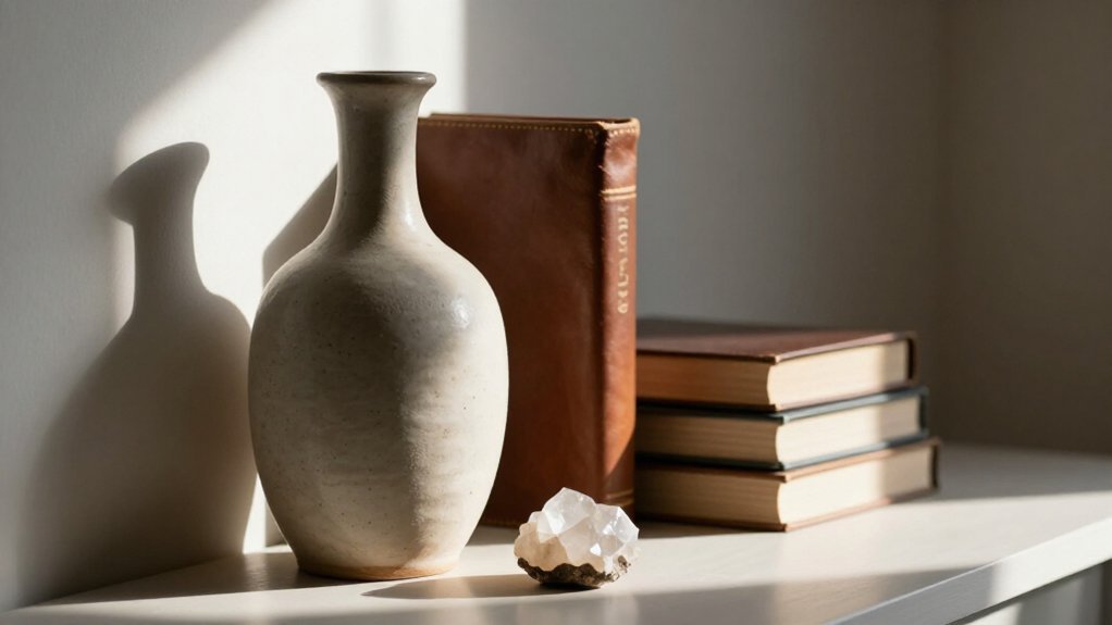
Where does your shelf fall apart when you step back? It probably lacks depth. You fix this with layering, building clear back middle front rows that pull the eye inward.
Where does your shelf fall apart when you step back? It probably lacks depth. You fix this with layering, building clear back middle front rows that pull the eye inward.
Start with tall items in back, framed prints or upright books, for your vertical foundation. Drop medium-height pieces, a candle or small sculpture, in the middle layer. Ground everything with short objects up front, a tiny succulent or short book stack. This three-tiered approach creates instant depth.
Keep varying heights within each row, and never line items up like soldiers. A staggered arrangement, where pieces sit slightly off-center from the row behind, builds visual interest without chaos. You want controlled asymmetry, not clutter.
Check your shelf from multiple angles. Adjust until no single layer dominates. The result reads intentional, not accidental.
Recommended Products
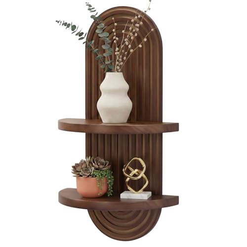
Art and Utility in One -- Elevate your space with the aesthetic room decor shelf, a harmonious blend of mid century modern and art deco design. Showcase your cherished items and collections in a stylish, eye-catching display.
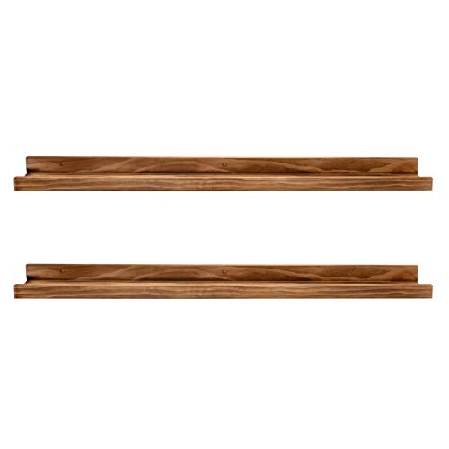
Sleek Modern Design: The minimalist photo ledges are built to blend in with the decor of your home, display photos of your best moments in life.

Decorative Wall Shelves: The metal vine design for these floating shelves adds a touch of elegance to your home while making your space unique. Decorative shelves are beautiful and fit any things in your wall.
Style Floating Shelves With Plants, Books, and Ceramics
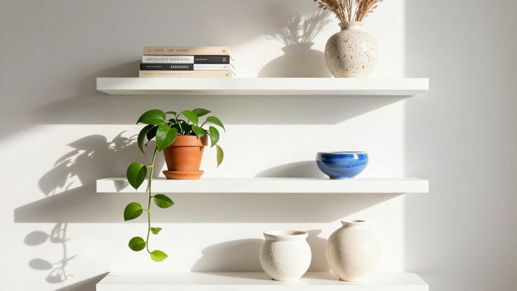
Once you’ve locked in your layering technique, turn your attention to the specific contents. Combine three objects of varying heights on the same shelf, such as a tall plant, a medium stack of books, and a short ceramic object, to create an instant, balanced trio. You’ll add visual depth by laying books horizontally in small stacks beside a ceramic vase and a trailing plant, building texture at different planes.
Place a ceramic piece with a matte glaze next to a glossy plant pot and a neutral-toned book spine to introduce contrast in finishes. Lean a small art print above a short stack of books, with a potted plant nearby, for layered depth without overcrowding. Rotate seasonal plant choices, pothos or snake plant, and mix ceramic textures, stoneware or terracotta, to keep your display fresh while maintaining balance.
Recommended Products

Centerpiece of Room Decoration - These shelves boast a distinctive design and an elegant shape, making them a focal point that elevates the style of any room. Ideal for the living room, bedroom, study, bathroom, laundry room, children's room, or office, they reflect the owner's sophisticated taste and blend seamlessly with various decor themes.

[More Space For Your Home] Why not try a wall when your house floors and desktops are cluttered? Fixwal set includes 6 floating shelves that can fulfill your storage needs in multiple spaces in your home such as bathroom, bedroom, living room, kitchen, den and more!

Elevate Room Aesthetics - Boasting a unique design and elegant silhouette, these wall shelves become the focal point, upgrading any room's decor. Perfect for spaces like living rooms, bedrooms, bathroom, studies, and more.
Create a Diagonal Arrangement for Visual Movement
How do you keep the eye moving across a static shelf? You create a diagonal arrangement that guides the eye from corner to edge using visual movement.
Start with varying heights in a stepped progression. Place at least three objects of different sizes along an invisible diagonal line. Alternate tall and short pieces, leaving gaps for breathing room so nothing feels crowded.
Varying heights in stepped progression guide the eye: three objects, alternating tall and short, with breathing room between.
Add depth layering by putting a taller framed print at the back, then shorter items in front. This builds dimension without clutter. Follow the rule of three for balanced groupings, keeping colors and textures varied along the line.
- Place items along an invisible diagonal from corner to opposite edge
- Use three different-height objects minimum for clear flow
- Alternate tall and short pieces with gaps between them
- Layer a tall back piece with shorter foreground items
- Vary colors and textures while grouping in threes
Recommended Products

Stylish Wall Mounted Shelves: Our vertical shelf unit are elegantly designed to add to your wall decor layout, the tower design is very practical and this five mounted floating shelves will fit perfectly into any home décor.

Slim Design: Perfectly sized for a curated display of vinyl records, nail polish, small photo frames, mini action figures, and sports cards. The vinyl shelf's compact dimensions (12"W x 1.57"H) feature a slim 1.5" inner depth to securely hold your lightweight items.
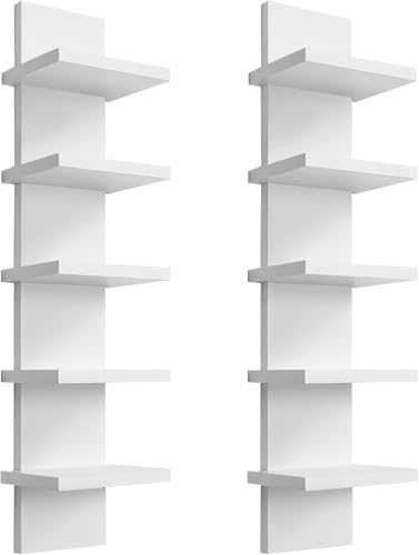
Stylish Wall Mounted Shelves: Our vertical shelf unit are elegantly designed to add to your wall decor layout, the tower design is very practical and this five mounted floating shelves will fit perfectly into any home décor.
Combine Wood, Ceramic, and Matte Finishes
A diagonal arrangement gets the eye moving, but the real payoff comes when you mix materials that invite touch.
Build Tactile Contrast****
Pair warm wood tones with matte ceramic pieces. This creates texture that reads balanced and casual. You’re not matching, you’re layering.
Vary Heights and Surfaces
Mix wood, ceramic, and matte finishes at different heights within one shelf grouping. This enhances depth. Avoid duplicating identical finishes. Combine a walnut shelf, a matte ceramic vase, and a contrasting glaze. This prevents a monotone look.
Emphasize Dimension
Use texture variety: rough live-edge wood, smooth glazed pottery, flat matte surfaces. This emphasizes layering and dimension.
Maintain Breathing Room
Aim for 30/70 negative space while distributing these three finish types. Your display stays organized, not crowded. The result feels intentional, accessible, and ready to live with.
Recommended Products

Elevate your space with our 3-piece floating wall mounted shelves, crafted from sturdy engineered wood in a sleek black finish. Each shelf measures 15.75 inches long, 5.1 inches deep, and 1.8 inches thick, providing ample storage space for decorative items, books, or bathroom essentials. The unique lip design keeps contents secure, with each shelf supporting up to 20 lbs. Easy to install with included hardware, these modern, minimalist shelves create a clean, symmetrical gallery wall. Perfect for nurseries, bedrooms, living rooms, or bathrooms, they offer multi-functional storage and add a touch of elegance to any decor style.
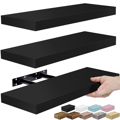
Black Floating Shelves for Wall Storage: Display charming showpieces, home decor items, and other prized possessions while offering functional wall book shelf storage. Our bathroom shelf Measures approximately 16.25 inch L x 5.50 inch W - Each floating shelf is 1.5 inch thick

Well-Designed Floating Shelves: Our floating shelves are made of MDF Laminate with a rustic brown matte finish. These wall shelves can not only organize daily sundries to make your space tidy and neat, they can also display your art pieces on the wall to decorate your home and make it full of aesthetic flare
Size Floating Shelves to 50–75% of Wall Width
Where do you start when a wall feels too empty or too busy? You measure the wall width first, then pick a shelf width that hits 50 to 75 percent of that span. This proportion leaves wall space visible on both sides, so the shelf looks framed, not crammed.
Start with the wall, not the shelf. Measure first, then choose a width that covers half to three-quarters of the span for balanced, framed proportions.
Measure wall width before you shop for any shelf. Target 50 to 75 percent coverage for solid visual balance. Keep some wall space open on each side, never edge to edge.
Match this proportion across multiple shelves for a gallery display feel. Avoid going outside the range, or the look turns cramped or sparse.
Stick to this rule and you get a clean, unified arrangement every time.
Recommended Products

【Transform Books into Wall-Mounted Art】: Another way to store and display your favorite books. Stacking books on the sturdy metal shelf, the shelf will become hidden behind the books which looks like books are floating on your wall. Perfect for book lovers and home decor enthusiasts.

🎨 Unique Fluted Edge – Handcrafted Boho Wall Decor:This arched shelf is a true wall art decor piece. The handcrafted, grooved trim highlights natural pine grain and adds a layer of boho wall decor warmth — a perfect fusion of mid century modern wall art and art deco charm for any living room or bedroom.

Art and Utility in One -- Elevate your space with the aesthetic room decor shelf, a harmonious blend of mid century modern and art deco design. Showcase your cherished items and collections in a stylish, eye-catching display.
Place Shelves at Eye Level Near Seating
You’ll want to position your floating shelves at eye level so you can view and grab items without straining your neck or tilting your head. For living rooms, mount shelves 57–60 inches from the floor, which aligns with standard sofa height and creates a comfortable visual balance while seated.
At desks or work areas, set shelves around 62–66 inches high to keep essentials within easy reach without breaking your line of sight.
Recommended Products

Boho Home Decor Set – Elevate your home décor with 2 pieces beautifully designed arched bohemian wall shelves. The intricate layered arch detail adds a sense of depth and warmth, making it a perfect statement piece for any modern, bohemian, or minimalist space. Whether styled in the living room, bedroom, dining room, narrow space or entryway, the modern wood wall shelves blend art and function seamlessly.

STYLISH DESIGN: Two Pine boards with Two Roman column misaligned combination design of the display shelf make it a style statement in any entrance, corridor, Nursery, Mudroom, Hallway, Bathroom, Bedroom, Living Room, Kitchen, Office

Decorative Shelf for Wall Decor - Walasis architectural corbels wood ledge shelf white are adorned with distressed crown molding, exuding an unique French country wall accent. Whether you want a shabby-chic farmhouse style, or a touch of vintage, these victorian wall shelf are the utility choice.
Optimal Viewing Height
Why settle for shelves that force you to crane your neck? You need smart shelf placement that respects your seating eye level and keeps your display height within a natural viewing range.
- Position shelf centers at 57–63 inches from the floor for average adult eye level
- Align the center of gravity with your comfort line to avoid bending or reaching
- Target 60 inches high in living rooms for easy, head-tilt-free viewing of art and books
- Keep bottom edges of top items at 40–52 inches near sofas and chairs
- Use 48–60 inch eye-level ranges in smaller spaces to maximize perceived room height
This viewing range ensures you enjoy your items without strain. Proper shelf placement turns your walls into functional displays you actually want to look at.
Seating Proximity Rule
How close should your shelves sit to the sofa? You want your floating shelves within arm’s reach when seated, so you don’t stretch or crane awkwardly. Position them 6 to 8 inches (15 to 20 cm) above or below your seating backrest. This keeps your visual line comfortable while reading or relaxing.
For eye level, aim for 58 to 64 inches (147 to 163 cm) from the floor. That’s common seated eye height for most adults. Your seating proximity matters because it shapes how you interact with every shelf grouping. Use your sofa or chair as a reference point, and you’ll create cohesive arrangements that feel connected to the space.
Plan your décor placement so adjacent shelves relate to your seating area. They shouldn’t feel isolated. This integration makes your display practical and visually grounded.
Visual Comfort Balance
Now that you’ve locked in your seating distance, it’s time to get the height right. You need eye-level placement at 57–63 inches from the floor, so seated guests view items without tilting. This height anchors visual balance between your seating and wall space.
Mount shelves 57–63 inches high for natural viewing from chairs and sofas. Apply the Rule of Three, grouping varied-height objects for dynamic energy. Limit shelf surface coverage to 30%, leaving 70% open space on shelves.
Align focal pieces with surrounding seating sightlines, centering attention. Position shelves within arm’s reach of seats for immediate accessibility.
You preserve calm by preventing crowding. The 30/70 ratio keeps displays breathable. Matching your central piece to seated sightlines eliminates head-turning strain. You create comfort through intention, not accident.
Apply the 30/70 Rule: Leave 70% of Shelf Surface Open
Where exactly should you stop when filling a shelf? You apply the 30/70 rule, and you stop at 30% full.
This shelf styling guideline gives you a clear target: occupy about 30% of your surface, and leave 70% as open space. You get negative space that draws your eye to what matters, and you cut visual clutter fast.
You check your work with one test. If you can’t see surface between items, you’ve got too much. You pull one piece out, maybe two.
Breathing room isn’t empty space wasted; it’s what creates visual balance across your arrangement. You mix heights and textures within that tight 30%, and you let the 70% openness do the quiet work. Your shelf feels intentional, not crowded, and your eye rests exactly where you planned.
Recommended Products

Enhance Your Space with Bohemian - Style: These bohemian - inspired floating shelves are a perfect addition to any home decor enthusiast's collection. The unique design, featuring a combination of wood and rattan elements, exudes a laid - back, yet stylish boho vibe that effortlessly elevates the aesthetic of your living room, bedroom, or even a cozy reading nook

INCLUDES – 2 slate display ledges, 8 medium strips; 1 display ledge holds 2 lbs

Design: This small floating shelf is made of 100% solid wood, with 2cm wood and these two screws at the back for reinforcement, making it more durable and firm. It is hand-polished,, and has a retro country style, which can be matched with most decoration styles.
Style Live-Edge Wood Shelves for Natural Texture
Why settle for flat, uniform shelves when you can display something with actual character? Live-edge wood shelves preserve the tree’s natural edge, giving you organic contours and variable thickness that flat boards simply can’t match.
Our solid walnut shelves display natural color variation, from lighter sapwood to deeper heartwood tones. The natural texture creates tactile warmth and irregular grain patterns. You enhance this contrast by pairing with smooth ceramics, glass, or matte finishes.
For styling success, follow these steps:
- Place taller items toward the back, following the live-edge curve
- Use layered heights to build depth and avoid flat displays
- Mix plants, vases, and small sculptures for visual balance
- Pair with modern farmhouse or rustic palettes
- Let the wood’s organic shape guide your arrangement
You’ll create displays that feel intentional, not cluttered.
Recommended Products
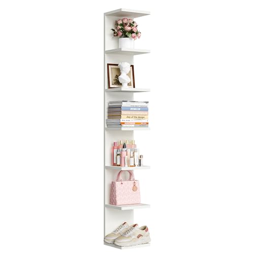
【Rounded Edges and Invisible screw Hole】The list includes hole covering stickers, which create a seamless appearance after being applied. And the edges of each layer of wood are rounded, making it safer to use.

Stylish Wall Mounted Shelves: Our vertical shelf unit are elegantly designed to add to your wall decor layout, the tower design is very practical and this five mounted floating shelves will fit perfectly into any home décor. Warm tips: Please be sure to check the product size and installation method in the picture before purchase, hope you have a happy shopping.

Sorbus Corner Wall Shelf: This floating vertical wall shelf unit is ideal for showcasing your favorite books and keepsakes in any space. Featuring five square shelves and two clothing hooks, this storage organizer is designed to maximize space and elevate blank wall space.
Edit Until Your Shelf Feels Almost Too Empty
You will know your shelf has crossed into overcrowding when your eye cannot settle on any single piece, or when items appear to lean against one another without clear gaps between them. Apply the removal rule: take away one object, step back, and reassess; if the arrangement suddenly feels correct, you have found your answer.
Stop only when the display feels almost too sparse, as that slight emptiness guarantees each remaining item earns its place.
Recommended Products

SPACE SAVING & LOOK NEATER - 3 pack acrylic shelves for wall provide multi-layer storage, allowing you to utilize wall space more efficiently. You can conveniently store everything while keeping your room organized. It's a great space-saving wall organizer!

2 Methods to Install: The acrylic ledge shelf equipped with 9 double-sided tapes, and 6 mounting screws. Tips: Pls make sure the wall is smooth, clean, dry, and then attach the tape to the all back, press evenly to release bubbles, better load bearing
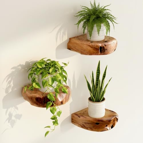
Premium Cedar Wood Construction: Crafted from durable cedar wood, these floating wall shelves offer lasting beauty, natural character, and rustic charm. Each shelf showcases rich wood grain and organic texture that complements a variety of home decor styles.
Signs of Overcrowding
When does a styled shelf cross from orderly to chaotic? You spot overcrowding when no surface peeks between items, when objects touch or overlap, when breathing room vanishes entirely.
Watch for these warning signs:
- No visible shelf surface between your pieces
- Items touching, overlapping, or fighting for space
- A cluttered feel that busies the wall behind it
- No dominant piece; your eye bounces endlessly
- Textures and colors competing, killing visual balance
If you can’t pinpoint a focal point, you’ve got too much happening. Overcrowding steals calm from your arrangement.
Try this quick test: picture one item removal. If the shelf suddenly feels almost right, not too sparse, you found your culprit. Trust that instinct. Visual balance lives in restraint, not accumulation.
The Removal Rule
Editing takes guts, but your shelf will thank you for it. The removal rule is your editing weapon. Start by pulling one piece when your display looks almost right; that’s usually your signal there’s one item too many.
If surfaces show no visible gaps between objects, you’re facing overcrowding. Prune items until breathing room returns. Aim for the 30/70 rule: keep only about 30% filled surface. This benchmark quickly reveals what must go to restore balance.
Watch for items touching, overlapping, or shelves busier than your wall behind them; these are red flags. Adopt iterative editing. When uncertain, remove something, step back, reassess before re-adding anything.
Shelf styling succeeds through subtraction, not addition. Trust the emptiness. Your eye needs space to rest, and your objects need room to shine.